Showing posts with label article. Show all posts

1/9/17

A photo taken in 1985 has resurfaced this week. Kelly Grovier looks at the power of a figure pushed to breaking point.


Some images never go out of date. They remain endlessly urgent. Where most viral photos enjoy a fleeting flash of fame, flaring up like a rash across social media, there is a cache of imperishable images that have lingered longer and strike a deeper chord. They stay forever part of the mind’s permanent collection of archetypal signs.
Predating by decades the instant-reaction platforms of Facebook and Twitter, an edgy image captured on the streets of Växjö, Sweden in April 1985 during a demonstration by the Neo-Nazi Nordic Reich Party succeeded (without today’s propulsive power of ‘likes’ and ‘retweets’) to imprint itself on the cultural consciousness. Snapped at the instant when a Polish-Swedish passerby, whose mother had reportedly been sent to a Nazi concentration camp, could no longer contain her irritation at having to share civic space with fascists, the black-and-white photo of Danuta Danielsson clocking a Neo-Nazi with her handbag continues to resonate for many as a silent rallying cry.
This 1985 photo has resurfaced on social media this week (Credit: Hans Runesson)
This photo – taken in 1985 – has resurfaced on social media this week (Credit: Hans Runesson)
Over the past few weeks, amid a spate of protests in America and throughout Europe in response to the outcome of elections and referenda, the image of the 38-year-old Danielsson lashing out in full swat has experienced a fresh resurgence, accompanied by the call to arms: “Be the woman hitting a Neo Nazi with a handbag you wish to see in the world”. 
Inviting readers to debate when even mild forms of violence are socially acceptable, the photo – taken by Hans Runesson – belongs to a long tradition of depictions of female figures pushed to breaking point. Artemisia Gentileschi and Caravaggio both explored the subject in their respective portrayals of the gruesome biblical story of Judith, who beheaded an Assyrian general planning to destroy the city of Bethulia. The Baroque painter Elisabetta Sirani was likewise drawn to Plutarch’s story of Timoclea, who pushes the man who raped her into a well.
(Credit: British Library)
The Luttrell Psalter intertwined biblical illustrations with scenes of ordinary life (Credit: British Library)
Long before these more famous scenes of female vengeance is the vision of quiet come-uppance meted out by a spinning rod-swinging wife on her abusive husband found in the 14th-Century manuscript The Luttrell Psalter, a sacred tome that innovatively intertwines biblical illustrations with scenes of ordinary life. The Medieval wallop doodled in the margins of the Psalter seems more a display of exasperation than a lethal blow. Created in an age when it was legal for a husband to beat his wife, the illustration is more courageous than slapstick. Like the photo of Danielsson, it sticks in the mind as an illustration of the difference between behaviour we might understand and behaviour we can applaud.

12/1/16

Why Time’s Trump Cover Is a Subversive Work of Political Art


This year, it should come as no surprise that President-elect Donald Trump was chosen to grace the cover of Time’s annual issue (shot by Jewish photographer Nadav Kander). “For better or worse,” Trump, during his campaign and now after his election, has certainly been among the greatest influences on the events of the year. For clues as to how Time feels about that question — is it “for better or worse?” — we can look to the image chosen for the cover of the issue. The decisions that Time made regarding how to photograph Trump reveal a layered, nuanced field of references that place the image among, in this viewer’s opinion, the magazine’s greatest covers. In order to deconstruct the image, let’s focus on three key elements (leaving aside the placement of the ‘M’ in ‘Time’ that makes it look like Trump has red horns): the color, the pose, and the chair:

The Color
Notice how the colors appear slightly washed out, slightly muted, soft. The palette creates what we might call a vintage effect. ...namely, Kodachrome. Kodachrome, It was immensely popular between the late 30’s and 70s, and its distinctive look defines our common visual concept of nostalgia.
 Trump ran a campaign based on regressive policies and attitudes — anti-environmental protection, anti-abortion, pro-coal, etc.... also about traditional values (defined primarily by the Christian right), about nostalgia for American greatness and security, about nostalgia for a pre-globalized world.
The Pose
Trump’s pose can be read as a subversive play on a traditional power-portrait pose.....
The Lincoln Memorial ...We see our subject head on, ...The angle forces us to look up at the subject, which in turn creates the impression that the subject is looking down at us. This pose and angle,... makes the subject appear dominant, powerful, judging.
On the Time cover, instead of seeing Trump head on and from below, we see him seated from behind and roughly at eye level. The power relation has shifted entirely.
Trump’s turn towards the camera renders the tone conspiratorial rather than judgmental. ... By choosing not to shoot Trump head on, the Time cover almost offers us a “behind the scenes” glimpse of the man who has spent so much of his time in front of the camera..The highly posed and processed nature of the photograph offers yet another level of irony.
Finally, we must note the ominous shadow lurking on the backdrop. It’s a small, but important and clever detail. Just as this image provides us with two theoretical points of view, it also provides us with two Trumps — Trump the president-elect, and the specter of Trump the president, haunting in the wings, waiting to take form.
The Chair
The masterstroke, the single detail that completes the entire image, is the chair. Trump is seated in what looks to be a vintage “Louis XV” chair ....The chair not only suggests the blindly ostentatious reigns of the French kings just before the revolution, but also, more specifically, the reign of Louis XV who, according to historian Norman Davies, “paid more attention to hunting women and stags than to governing the country” and whose reign was marked by “debilitating stagnation,” “recurrent wars,” and “perpetual financial crisis” (sound familiar?).
...It’s a gaudy symbol of wealth and status, but if you look at the top right corner, you can see a rip in the upholstery, signifying Trump’s own cracked image. ....— the entire illusion of grandeur begins to collapse. The cover is less an image of a man in power than the freeze frame of a leader, and his country, in a state of decay. The ghostly shadow works overtime here — suggesting a splendor that has already passed, if it ever existed at all.
.... like “The Picture of Dorian Gray” suggests more than just a physical deterioration.
As a photograph, it’s a rare achievement. As a cover, it’s a statement.

9/15/16

Thin Lines Between Coincidence, Plagiarism, and Inspiration


When is an idea just coincidental and when is it stealing. There have been many waves of themes in art that sometimes make you think was this a unconscious hive mind thought or did one company hear about it and create the same thing to compete.

Examples of the supposed hive mind happen a lot in entertainment current events have that effect and making money is the producers goal.

Remember Dantes peak and Volcano
Image credit: MovieGoods.com / ReleaseDonkey.com

There are Tons of examples of the hive mind at work


Then you have people who reference other artwork or depending who you talk to rip it off. My college friend refused to talk about the Lion King because her favorite show was Kimba the white Lion


Or Disney copies their own work


Is it an homage to the days of old laziness (animation is expensive) no clue
there are many famous artworks out there that everyone has seen and have imprinted on their minds. Composition mathematics causes artists to make similar decisions because it is pleasing to the eye. Pantone 448 C, declared the world's ugliest color, is not going to be used anytime soon.

The most recent example is this article . Ankur Patar was hired by Adobe as part of a campaign to show off their stock photo collection. His task was to recreate "The Storm on the Sea of Galilee," a 1633 painting by Rembrandt that was stolen in 1990 and never recovered. Using only stock images, Patar was able to create a remarkable imitation; you can see his process here on his website

an artist in the Fstoppers Community had posted his own recreation of the exact same Rembrandt painting six months prior to Adobe's new ad campaign. Although Joël Vegt's version was a bit more humorous, the resemblance was rather uncanny.

Read more on how this story turns out

The long and short of it we really never know what happens in the artists mind. It is up to us to police ourselves and do what we believe to be morally right. The golden rule still applies and if you had this happen to you it is a difficult position to be in. Keep records of your work date, photograph, watermark, hide little clues like old mapmakers of the past and know if your art is stolen and you can't do anything about it you are still good enough for someone to want to take credit for your work. Make more art better that what they stole challenge them to online. Never stop or they'll really win


https://fstoppers.com/composite/these-photos-show-thin-lines-between-coincidence-plagiarism-and-inspiration-139597

9/11/16

The Falling man and facing what really happened

While the towers were still smoldering memories of that day were being altered, sanitized, edited for those we thought to shelter from the horror. 15 years later teenagers and even adults to lived during that time are unaware of the great impact it had and make light of it. It was called our Pearl harbor by my classmates in high school. A college friend heard this in class and knew their aunt must be dead. Another friend introduced me to the former security member of Logan airport from that day. My father took many business trips and had no clue if he could have been on one of those planes till I got home, no cell phones. There was fear, confusion, and a jumble of information. I did not register or know that people were forced to fall from the towers till a documentary was made a year later.

At least 200 people are believed to have fallen or jumped to their deaths that day while other estimates say the number is half of that or fewer.[1][2][3  The photograph initially appeared in newspapers around the world, including on page 7 of The New York Times on September 12, 2001. The photo's caption read "A person falls headfirst after jumping from the north tower of the World Trade Center. It was a horrific sight that was repeated in the moments after the planes struck the towers."[7] It appeared only once in the Times because of criticism and anger against its use.[8] Six years later, it appeared on page 1 of The New York Times Book Review on May 27, 2007.[9]
 History books have a paragraph here or there and that's it. Though it is natural to deny terrible things to protect our emotions. We must face everything that happened or we will learn nothing it is only then that those that died will not have done so in vain. 


7/29/16

Victoria’s Secret retoucher reveals her techniques

A former Victoria’s Secret retoucher recently spilled the tricks of the trade to Refinery29,


1. Retouching existed long before Photoshop.
sometimes the color of a shirt doesn’t translate well when photographed, and the retoucher fixes it to show the accurate shade.You want something to pop more go ahead. "And then this thing just spiraled out of control.”
2. Body “fixing” starts on set.
 says Sarah. “I don’t think I ever was on a shoot with a model that had real hair.” Next, pads to alter the model’s breast size and body shape. Ears glued down and of course the spray on tan.
 “They put a push-up bra under the bathing suit. And we retouch out the bra...a lot of [staffers] would complain because they even did it with strapless stuff. When you're wearing a strapless bikini, in no way, shape, or form [can] you have cleavage. It’s physically impossible with the way gravity works.” it’s barely her body anymore.
 
3. No one’s [insert any body part] looks like that.
Next comes the digital alteration: The bra gets taken out, and the nipples erased. Sarah was often asked to make breasts rounder, higher, perfectly symmetrical, and of course, larger (“they all have [size] A’s,” she says.)

“Everyone has blue hands and blue feet,” says Sarah. That’s just the way extremities show up in a picture. Furthermore, everyone’s armpits turn gray on camera. No matter how closely you shave, you’ll have a shadow, she says. And many of the models she worked with didn’t bother even shaving:  They all have stubbly pubes — all the normal stuff [non-models have].”

 “Models are thinner than you actually think they are, and we retouch them to look rounder.” Sarah routinely plumped up butts, hid protruding ribcages, and softened sharp hipbones under digital flesh. “We have to curve them out.”
4. So, why not just hire “curvier” models?
Because they don’t sell. Here’s where the business of beautifying gets even uglier. During Sarah’s time at Victoria’s Secret, “they tried different models and different body types all the time.” Consumers just didn’t respond.

“One time, during a swim season, they had these two girls come in that had abs and thick thighs and busts. They were really toned and their skin was amazing. They were still obviously models. But they were a different look. But, they didn’t sell anything and so they stopped using those girls.”

This is what Sarah means when she says “we’re choosing this” — if consumers responded positively with their dollars to less conventionally shaped models, brands would use them more in imagery.

5. In the end, it’s just about selling.
“The reason people retouch bodies is because they're just trying to sell you something,”
6. It’s not just one industry. It’s all of them.


Take Instagram, for example. “Just a reminder, fitspo pictures aren't a real thing,” says Sarah. Even when they’re not retouched (which she says they often are), Sarah points out that they’re using the same lighting and posing tricks used on a professional shoot. “And, when you're manipulating the light and the camera angle like that, that’s technically retouching, because you're manipulating something to look as if it's something it's really, truly not in real life.”

And just as straight-size models get plumped up, plus-size models get slimmed and smoothed. “Anything to make [them] look delicate,” says Sarah. Not just waists, but wrists and ankles are taken in. “They make the neck more narrow because that is a very female, delicate thing to have.”

Even worse, child models are subjected to the same manipulations.  "‘Can you make this 9-year-old look less tired?’”

It seems extreme, but it’s utterly standard.

8. Sometimes “fixing” is really “swapping.”
“There's a lot of the switching bodies up,” says Sarah. She gives a common example: “‘Can you change these arms with a different girl's arms, because her arms are making it look like she's, like, picking her butt’ — or something.” Awkward gestures are often fixed this way. “A lot of the time, retouching isn't about trying to make a body look ideal, but also to avoid criticism of the image.”

9. Some things are changing — and some may never change.

“I won't take in waists anymore. I refuse to do that,” she says.  Teeth and eyeball whitening. “Nobody has really white eyes” she says.”

Still, there are some standard practices she doesn’t see leaving anytime soon. Just as nearly every model has acne, cellulite, and stretch marks (Sarah's reminder: “You don’t get 6 feet tall during puberty without having stretch marks.”), every retoucher knows to remove them.

 Most of her clients ask for her to lift them a bit, “which is, like, okay. It's not the worst thing in the world. I'm not copying and pasting boobs. At least I'm not doing that. I'll take it.”

While Sarah’s glad to see pushback within her industry, she knows that the bigger battle is changing consumer hearts and minds — even her own. “I ordered a Victoria's Secret swimsuit this summer. And then I got it and, of course, it wasn’t as cute as in the photo. I'm the one retouching this stuff and I'm still not immune to marketing. It's incredible.”

7/15/16

Nun pop artist

For everyone visiting Boston for the summer and sees those gas tanks here
is their story
        
Corita Kent is a name not that well-known outside a small circle of art world admirers. Our Faith Salie reports on an exhibition that is hoping to change that:
corita-kent-gas-tank-244.jpg
Corita Kent's 140-foot-tall "Rainbow Swash" gas tank, in Boston.
CBS News
It may just be the most famous gas tank in the world. That might not sound like much, but the "Rainbow Swash," as it's called, off Route 93 in Boston, is also one of the largest copyrighted works of art in the world.
Its story goes back to 1971, the height of the Vietnam War, when it was designed as an expression of peace by artist Corita Kent.
Kent also happened to be a nun.
"Corita Kent and the Language of Pop," an exhibit currently on view at the San Antonio Museum of Art, features about 145 works of art by Kent and by her main counterparts in the pop art movement.
Museum director Katie Luber hopes the exhibit places Kent's name firmly alongside her better-known contemporaries.
When asked why Corita Kent isn't a household name, Luber replied, "I think it goes back to the problem that pop art has, in terms of criticism and reception, really been seen as a male-dominated art form. And she is a woman, and she is a nun."
Corita Kent was born Frances Elizabeth Kent in 1918 in Fort Dodge, Iowa. At 18 she entered the order of Sisters of Immaculate Heart of Mary in Los Angeles. She became Sister Mary Corita.
corita-kent-life-is-a-complicated-business-244.jpg
"Life Is a Complicated Business" (1967) by Corita Kent.
CBS News
For the next 30 years she would live and work at Immaculate Heart College, eventually heading its art department. During that time she developed her trademark style, combining the written word with silkscreen designs -- an inexpensive medium allowing her to make affordable and accessible art.

Read More

5/16/16

Rhinos with Camera Implants Fight Against Poachers

A  a UK-based non-profit named Protect created a new system for stopping poachers. Giving rhinos GPS tags, heart rate monitors, and camera implants in their horns.

Part of a system called Real-time Anti-Poaching Intelligence Device (RAPID)  embedded in its skin and horn — the camera can be installed in the horn without any  harm to the animal.


embeddedrhinocam2

If a rhino is ever attacked by poachers the change in heart rate will alert operators at a control center. If poachers are observed in the live video feed, park authorities can be sent to the animal’s aid in a matter of minutes using the transmitted GPS coordinates. The rapid response will (hopefully) leave poachers with no time to harvest horns or escape from the scene.
An estimated 1,200+ rhinos were killed by poachers in South Africa last year, which is about one killing every eight hours. It’s estimated that species of rhinos could go extinct within the next decade if nothing is done about the issue.
Protect hopes to widely deploy the RAPID over the next couple of years, and that knowledge of this new, high-tech system will deter poachers and force them to think twice before killing another rhino for its horns.


See more

4/28/16

JFK Library’s Ernest Hemingway Collection

The JFK Library’s Ernest Hemingway Collection is a treasure trove for fans of the writer including up close & personal (and rarely shared) photos, letters, receipts, book lists, fishing logs and other notebooks. Much of it has been digitised, but onsite research with permission from the archivists to see the collection is also possible. I went through as much as the digital archives as I could and picked out some highlights to get you started…

EH 7891P  Ernest Hemingway fighting a bull in "The Amateurs", Pamplona, Spain 1925. ("X H." on border below image). Photograph in the Ernest Hemingway Photograph Collection, John F. Kennedy Presidential Library and Museum, Boston.
Ernest Hemingway fighting a Bull in Pamplona, Spain (pictured in front of the horns of the bull).  Hemingway was participating in “The Amateurs” in 1925, one year before the publication of “The Sun Also Rises.”

See More

4/15/16

Why Old Sports Photos Often Have a Blue Haze

Rich Clarkson’s 1986 photo of Kareem Abdul-Jabbar.
Rich Clarkson’s 1968 photo of Kareem Abdul-Jabbar.
The blue haze that adds such a wonderful ambience to the arena is caused by cigarette smoke. The California Indoor Clean Air Act of 1976 was one of many regulations that started to clamp down on public smoking, and thus, we traded better light for better health. The same blue haze is evident in many historical boxing photos, like the ones made by Neil Leifer
Allen Murabayashi is the Chairman and co-founder of PhotoShelter. He co-hosts the "I Love Photography" podcast on iTunes.

4/1/16

War photography and how they share what they capture with the world.

While embedded with the 24th Marine Expeditionary Unit (24thMEU) in Afghanistan in 2008, I made thie brief video of New York Times Photojournalist Tyler Hicks as he prepared and then transmitted images from one of the most unforgiving locales on earth to the Times photo desk in New York. At the time I met Tyler, I was working on a piece in Afghanistan's Helmand River Valley, along the border with Pakistan, for NOW on PBS. (Titled, "Afghanistan: The Forgotten War," the piece was nominated for a national Emmy Award.) I think the video of Tyler illustrates the technology that has revolutionized the craft of visual journalism. More importantly, it gives viewers a sense of how professional, articulate and dedicated some of the practitioners of our craft can be. Tyler Hicks is an extraordinarily talented photojournalist and a role model for all who want to devote themselves to the craft.


from  billgentile.com an independent journalist and documentary filmmaker teaching at American University in Washington, DC. 

3/14/16

Cyanotypes: Photography's Blue Period


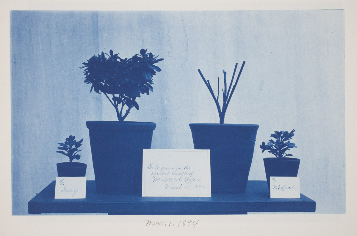
Frederick Coulson, American, 1869-1931, <em>Untitled,</em> March 1,1894, cyanotype, Eliza S. Paine Fund, 2010.271.32


January 16 - April 24, 2016Prints, Drawings and Photographs Gallery

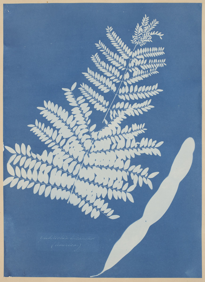
Invented by Sir John Herschel in 1842, cyanotypes are photographs with a distinctive Prussian blue tonality produced by treating paper with an iron-salt solution. The treated paper can be developed using only the sun, which made cyanotypes a favored technique among amateur photographers through the turn of the twentieth century. Cyanotypes: Photography's Blue Periodwill trace the rise of these "blueprint photographs" beginning with the botanical photogenic drawings printed by Anna Atkins in the 1850s. The exhibition will also feature contemporary artists who have recently revived the process manipulating the medium to varied expressive effects.
Organized in collaboration with a seminar from Clark University, the exhibition will be presented with thematic emphasis on botanicals, landscape, abstraction, and portraiture—areas that dominated much of the production of cyanotypes in the early twentieth century and recur in contemporary work. Artists on display include nineteenth and twentieth-century photographers Henry Bosse, Edward Sheriff Curtis, and F. Holland Day, and contemporary artist Christian Marclay.
Sponsored in part by:

Select Images

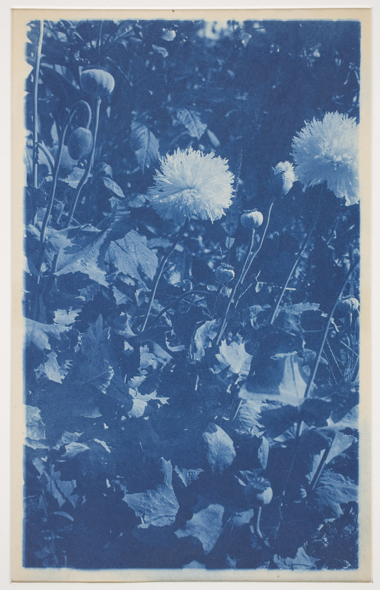
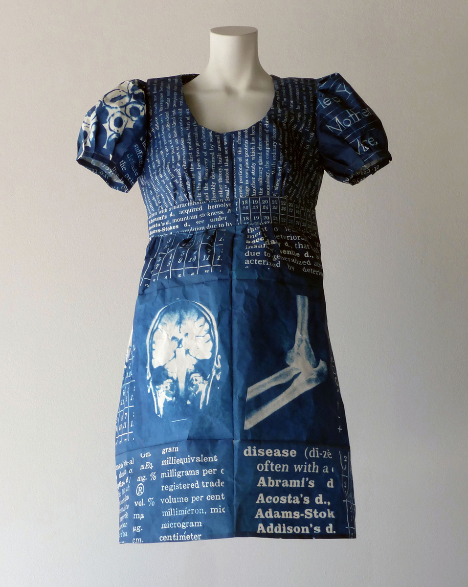
Anna Atkins, British, 1799-1871, <em>Honey Locust Leaf Pod,</em> about 1854, cyanotype, Stoddard Acquisition Fund, 1989.9Arthur Wesley Dow, American, 1957-1922, <em>Flowers with Pods</em>, about 1895, cyanotype, Sarah C. Garver Fund, 1997.74Christian Marclay, American, Unwound Cassette Tape, 2012, cyanotype, Courtesy of Elizabeth and Michael Marcus, E.90.15.1Annie Lopez, Medical Conditions, 2013, cyanotype printed on tamale wrapping paper, Courtesy of the Artist, ©Annie Lopez

Related Event


Cyanotypes: An Evening in Blue

February 18, 2016 6-8pm
Please join us as the Worcester Art Museum celebrates the publication of Cyanotypes: Photography's Blue Period, the catalogue associated with WAM's groundbreaking exhibition tracing the history of the cyanotype from the 1850s to the present.

From 6 to 7pm, tours will be offered by co-curators Nancy Burns (Assistant Curator of Prints, Drawings and Photographs) and Kristina Wilson (Associate Professor of Art History, Clark University), as well as the Clark seminar students who spent a semester researching this antique photographic process. Music, hors d'oeuvres, and a cash bar will be available throughout the event. Contemporary artists featured in the exhibition will also be on hand to celebrate. Join the fun and come dressed in your best blues! Free with Museum admission.

2/19/16

If you’re going to shoot photos of a lifetime you probably shouldn’t purchase a cheap $40 compact camera to do so.


  • Kirsty Fuller bought a Polaroid IE826 digital camera from the store in May 
  • 33-year-old took around 300 photos on the trip with her husband to Brazil
  • Insists she checked the settings before using the camera for the first time 
  • Told by Argos it was 'unreasonable' to expect quality images due to price 

    Are these the world's WORST honeymoon pictures? Bride's fury at out-of-focus photos taken with a £40 Argos camera


Read more: http://www.dailymail.co.uk/news/article-3168011/Bride-s-fury-40-Argos-camera-s-focus-honeymoon-pictures.html#ixzz3gSQn8bGW 

Lesson always fully test your camera before you use it for memorable moments

1/14/16

Long-lost home movies reveal one couple's love story

For all the valentines lovers out there here is another one from the pastFairpoint town historian Bill Poray was given home movies from the 1930s the box was labeled “Kodachrome experiment.” he searched for the girl who appeared to be the object of the camera operator's affection. Steve Hartman tells the story of what he found.


1/8/16

Here are the flaws photographers see when they take a picture of you, the job has many different demands


Here are the flaws photographers see when they take a picture of you
A professional photographer's job doesn't end after they snap their photograph, hell, in some ways that's when their job starts. In this image, The Today Show reveals what a photographer sees in his photo and what he needs to fix. And boy there is a lot that needs fixin'.
A seemingly normal photograph of the four photogenic hosts of the Today Show become shapes and circles and arrows pointing out people's flaws that must be corrected in Photoshop before its published. Whiter teeth, longer hair, bigger eyes, slimmer waist and more.
This viewpoint obviously doesn't apply to all photographers, different fields have different demands but it does speak to the culture we live in where a real photo isn't perfect until it's fake.
added a little bit in to emphasize the job has many different demands

12/9/15

Context is everything…

 especially when it drives an industry whose main objective is to benefit from increased profit.
your in person view of the Mona Lisa

While there is no arguing the world holds a bounty of beauty and mysteries to be explored, changing times have diminished some of the mysticism which is often displayed in photographs of ancient wonders.
Therefore, if pictures truly convey more value than words, we wonder what True Activist readers think of these famous landmarks photographed in ‘ideal’ setting, and then zoomed out

See more

10/30/15

An hommage to horror moms

‘It Felt Like The Right Time’ 

 Jamie Lee Curtis has been paying homage to her horror film roots with her role in Fox’s new series,“Scream Queens recreating her mother, Janet Leigh’s, infamous shower scene from “Psycho.”  


Christina Ricci, who as a child famously portrayed Wednesday Addams, dressed up as Morticia Addams...proven to be a photoshop but still a great image. 


8/22/15

Julia Margaret Cameron Victorian Celebrity photographer

Visiting Birr castle in Ireland recently I started reading up on early women photographers and Julia "caught my eye" 

The Parting of Lancelot and Guinevere

Artist: Julia Margaret Cameron (British (born India), Calcutta 1815–1879 Kalutara, Ceylon)
Date: 1874


A little bio from the MOMA

" one of the greatest portraitists in the history of photography, Julia Margaret Cameron (1815–1879) blended an unorthodox technique, a deeply spiritual sensibility, and a Pre- Raphaelite–inflected aesthetic to create a gallery of vivid portraits and a mirror of the Victorian soul."
"When she received her first camera in December 1863 as a gift from her daughter and son-in-law, Cameron was forty-eight, a mother of six, and a deeply religious, well-read, somewhat eccentric friend of many notable Victorian artists, poets, and thinkers. "From the first moment I handled my lens with a tender ardour," she wrote, "and it has become to me as a living thing, with voice and memory and creative vigour." Condemned by some contemporaries for sloppy craftsmanship, she purposely avoided the perfect resolution and minute detail that glass negatives permitted, opting instead for carefully directed light, soft focus, and long exposures that allowed the sitters' slight movement to register in her pictures, instilling them with an uncommon sense of breath and life.
"Cameron's three major bodies of work: portraits of men "great thro' genius," including painter G. F. Watts, poet Alfred, Lord Tennyson, scientist Sir John Herschel, and philosopher and historian Thomas Carlyle; women "great thro' love," including relatives, neighbors, and household staff, often titled as literary, historical, or biblical subjects; and staged groupings such as her illustrations for Tennyson's Idylls of the King or her Annunciation in the style of Perugino."

See more of her subjects here

And Here

6/22/15

Black Dogs Project

This photo series started after a conversation about how black dogs have a harder time getting adopted than other dogs. I decided to start a photo series photographing black dogs on a black background in my studio. Using social media, I recruited local dog owners who have black dogs to photograph. It's an amazing journey that will become a book in the fall of 2015.

Happy Mothers Day to all those moms to your two and four legged family.

6/7/15

The Chemistry Of Fraudulent Photographs


Esther Inglis-Arkell


The Chemistry Of Fraudulent Photographs
In the 1970s, newly-discovered pictures of “Victorian waifs” were a hit with both historians and art collectors. The chemistry seemed right. The context . . . not so much. But people only learned that too late.
In 1974, the work of Francis Hetling delighted the academic world. Hetling was a diarist and amateur photographer. He’d toured London taking photographs of Victorian orphans in Barnardo homes — homes set up in the 1870s by a philanthropic doctor, Thomas Barnardo. Although poor children were fashionable subjects for photographs, the Victorians liked their waif tableaux staged. Well-to-do children were given fake rags and often put in rural settings. Seeing what actual poor children looked like was an opportunity.
Of course, experts checked it out. The “photographs” were actually “calotypes,” or “talbotypes.” This added to the plausibility of the story. These types of images were an innovation in photographic technology. People had known for hundreds of years that certain preparations of silver would discolor when exposed to the light, and that this could be combined with a camera obscura to create images. The problem was making the images dark enough, detailed enough, and permanent enough. Many photographic methods in the 1870s required that people stayed put for up to an hour at a time, and some required heavy and delicate glass plates.
The Chemistry Of Fraudulent Photographs
Calotypes shorted the process to a couple of minutes, and required a sheet of prepared paper. Essentially, the piece of paper would be prepared with potassium iodide and silver nitrate — both light sensitive — and then stored for as long as the photographer liked. At the last minute, before the photograph was taken, it got washed in a solution of more silver nitrate and gallic acid. It could be exposed for as little as ten seconds, but usually more like a minute or two, depending on the light. The paper had no visible image on it. It was only later, by repeatedly washing it with more silver nitrate and gallic acid that a negative became visible. Once the photographer fixed the negative, they could then press this negative against a paper that had more traditional chemicals in it, and expose the image for as long as they liked. The final image would have at least traces of the chemicals used in the calotype process in it. The Hetling images did, although investigators could not be absolutely certain.
So it wasn’t the chemistry that caught “Francis Hetling.” It was a man who recognized the eleven-year-old daughter of a guy he knew. The girl turned out to have had her picture taken by Howard Grey, and man who worked in advertising and knew that nostalgia sold well. He staged pictures of Victorian waifs, and then gave them to Graham Ovendon, an artist who knew how to fake a photograph. The two weren’t exposed until 1978.
Looking back on the disaster, some art critics have found fault with one particular photo. We can see that it’s a poignant photo, and one that casts doubt as to the ethics of the photographer. A child in rags throws her hand in front of her face, ashamed to have her picture taken. But poor children of that time wouldn’t have had a concept of the notoriety or permanence that photographs could bring. More importantly, with the benefit of hindsight, it’s easy to see that there is too much motion in the photograph for it to have been taken at the time. It appears to be a quick, improvised gesture. The girl would have had to have frozen in that position for at least ten seconds, and possibly more like a minute or two, given the low light around her.
Grey and Ovendon were tried for fraud in 1980, but not convicted. The photographs, some of which had hung in the National Portrait Gallery, were taken down.